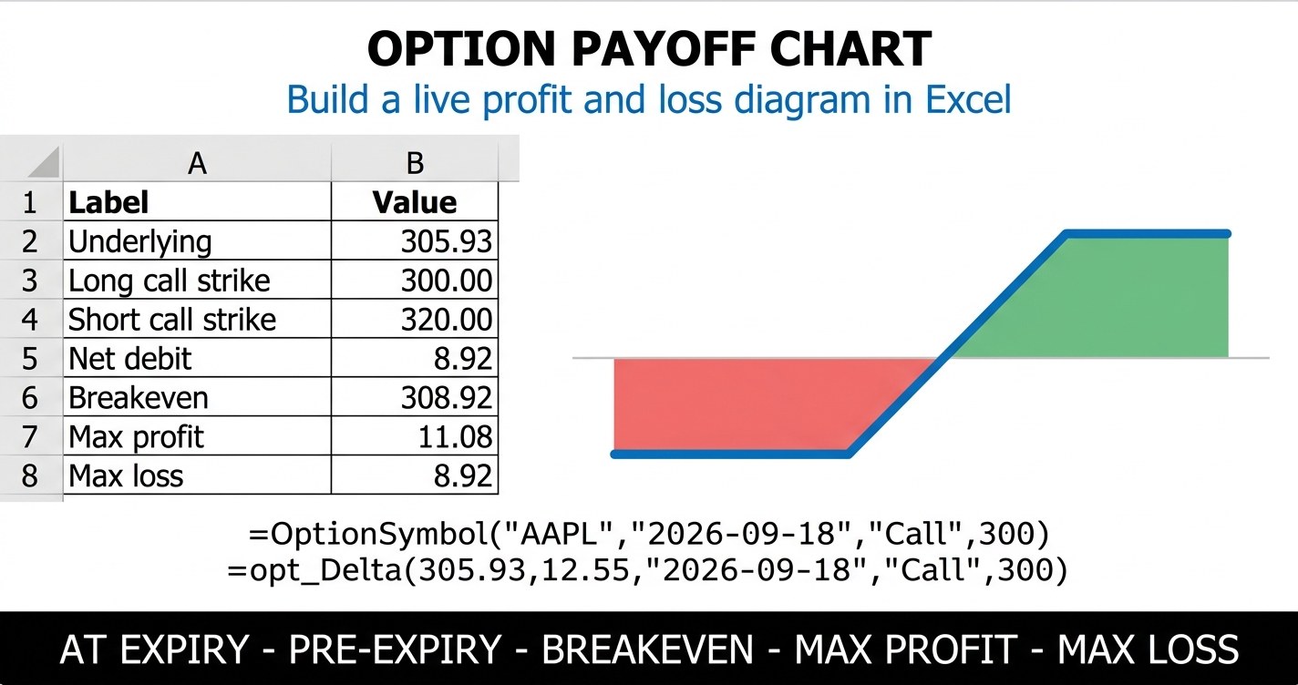
Option payoff chart shapes are familiar to anyone who has read an options article. A flat line, a bend, a diagonal ramp, sometimes a second bend and another flat line. What the textbook picture never carries is your numbers. The bends belong to your strikes, the height of the flat sections belongs to your premium and your contract count, and a generic diagram puts none of them where yours actually sit.
A payoff chart is not decoration. It is the position expressed as a function. Feed it every price the underlying could print, and it returns what you make or lose at each one. Every number a trader quotes about a structure, the breakeven, the maximum profit, the maximum loss, the reward to risk ratio, is just a feature of that curve read off at a particular point.
This guide builds one in Excel from scratch. Every figure below comes from a live AAPL option chain captured on August 15, 2026, and every formula shown is a real MarketXLS function. Two workbooks are linked near the end so you can drop your own legs into the same model and watch the diagram redraw.
Option Payoff Chart: The Position Behind Every Number Here
One position runs through this entire guide. It is a bull call spread on AAPL, chosen because it produces the most instructive shape available: two flat segments, one ramp, two elbows, one breakeven, and a hard cap in both directions.
| Field | Value |
|---|---|
| Underlying | AAPL at $305.93 |
| Expiry | 2026-09-18 (34 days) |
| Long leg | Buy 1 September 300 call at $12.55 |
| Short leg | Sell 1 September 320 call at $3.63 |
| Net debit | $892.00 |
| Strike width | $20.00 |
| Maximum profit | $1,108.00 |
| Maximum loss | $892.00 |
| Breakeven at expiry | $308.92 |
| Reward to risk | 1.24x |
Both premiums are bid ask midpoints from the September 18 chain. The 300 call quoted $12.40 by $12.70 and the 320 call quoted $3.55 by $3.70. Your own fill will land somewhere inside those spreads, which is the first reason to build the chart yourself rather than trust a screenshot.
What A Payoff Chart Actually Plots
The horizontal axis is the price of the underlying, not time. This trips people up constantly. A payoff chart does not show what happens next week. It answers a conditional question at every price simultaneously: if the stock finishes here, what is the result?
The vertical axis is profit or loss in dollars for the whole position, after the premium you paid or received. That last clause is what separates a payoff chart from a value chart. A long call is worth $5 with the stock at $305 and a $300 strike, but if you paid $12.55 for it, the payoff chart shows a loss of $755, not a gain of $500.
Everything else is read off the line:
- A crossing of the zero line is a breakeven. A vertical spread has one. A straddle has two. A butterfly has two. An iron condor has two.
- A flat segment means an option has expired worthless or is fully offset by another leg. Flat on the left of a bull call spread is both calls worthless. Flat on the right is both calls in the money, moving dollar for dollar against each other.
- The slope of the line is position delta in dollars per point. A steeper segment means the position gains or loses faster for the same move in the underlying.
- An elbow always sits at a strike. If you see a bend somewhere else, the chart is wrong.
Building The Price Grid, Which Is The Spine Of The Chart
A payoff chart in Excel is a table before it is a picture. Column A holds a ladder of underlying prices. Every other column evaluates the position at those prices. The chart object just draws what the table already says.
Pick a range that comfortably brackets every strike in the position. For the AAPL spread with strikes at 300 and 320, a grid running from $270 to $350 in $2 steps gives 41 rows and leaves both flat segments clearly visible on either side. A grid that stops at the strikes hides exactly the information the chart exists to show.
Put the low end and the step in their own input cells so the range is adjustable:
A26: =$B$23                 ' grid low, 270
A27: =A26+$D$23             ' add the step, 2
Fill that second formula down 40 rows. Now the axis is parameterised. Widen the step to $5 for a fast sketch, tighten it to $0.50 when you want the breakeven to land precisely.
The Per-Leg Payoff Formula
Each leg gets its own column, which is the single most useful design decision in the whole workbook. When the net line looks wrong, you can see which leg caused it.
At expiry, an option is worth only its intrinsic value. A call is worth the underlying minus the strike, floored at zero. A put is worth the strike minus the underlying, floored at zero. Profit is that intrinsic value minus what you paid, and the sign flips if you sold rather than bought.
One formula handles all four cases:
=IF($F$10=0,0,
   IF($B$10="Buy",1,-1)
   * (MAX(0, IF($C$10="Call", $A26-$D$10, $D$10-$A26)) - $E$10)
   * $F$10 * $H$6)
Reading the references: $B$10 is the action, Buy or Sell. $C$10 is Call or Put. $D$10 is the strike. $E$10 is the premium per share. $F$10 is the contract count, and setting it to zero switches the leg off cleanly. $H$6 is the contract multiplier, normally 100. $A26 is the grid price on that row.
Copy the formula across four leg columns and down the grid. Column F sums them:
F26: =SUM(B26:E26)
That column is the at-expiry payoff line. Everything else on the sheet is derived from it.
The Second Line Almost Nobody Draws
Most payoff charts show only the expiry line. That line is a special case: it is the position with zero time value left. For the 33 days before that, the position is worth something quite different, and the gap between the two lines is the part of the trade you actually live through.
Here is the AAPL spread evaluated both ways across the grid.
| Underlying | At expiry | Pre-expiry (34 days) | Time value in the gap |
|---|---|---|---|
| $270.00 | -$892 | -$805 | $87 |
| $280.00 | -$892 | -$677 | $215 |
| $290.00 | -$892 | -$460 | $432 |
| $300.00 | -$892 | -$161 | $731 |
| $305.93 | -$299 | $37 | $336 |
| $310.00 | $108 | $175 | $67 |
| $320.00 | $1,108 | $491 | -$617 |
| $330.00 | $1,108 | $741 | -$367 |
| $340.00 | $1,108 | $911 | -$197 |
| $350.00 | $1,108 | $1,011 | -$97 |
Look at what that table says. With the stock unchanged at $305.93, the expiry line shows a loss of $299 while the pre-expiry curve shows a gain of $37. Those are the same position on the same day. The difference is $336 of time value that has not been surrendered yet.
Now look at $320 and above. The gap turns negative. The pre-expiry curve sits $617 below the expiry line at the short strike, because the position has not yet collected the profit that only arrives when the short call finally decays to intrinsic value. On the upside, waiting is what pays you. On the downside, waiting is what costs you.
The pre-expiry curve needs Black-Scholes, which Excel handles natively. For one call leg:
=$A26*EXP(-$F$6*($G$6/365))*NORMSDIST(d1)
 -$D$10*EXP(-$E$6*($G$6/365))*NORMSDIST(d1-$G$10*SQRT($G$6/365))
where d1 expands to:
(LN($A26/$D$10)+($E$6-$F$6+$G$10^2/2)*($G$6/365))/($G$10*SQRT($G$6/365))
$E$6 is the risk free rate, $F$6 is the dividend yield, $G$6 is the days still remaining, and $G$10 is that leg's implied volatility. Use the legacy names NORMSDIST, LN, EXP and SQRT rather than their modern equivalents, because the legacy versions do not pick up the _xlfn prefix that renders as #NAME? when a workbook moves between Excel versions.
Set $G$6 to zero and the model collapses to intrinsic value, which is the expiry line. That is the elegant part. One block of formulas draws both curves, and the days-remaining cell is the dial between them.
Watching The Curve Fall Onto The Line
Because days remaining is a single input, you can step it down and watch decay happen. Here is the AAPL spread valued at the current spot price of $305.93 with progressively less time left.
| Days remaining | Position value | Above the expiry line by |
|---|---|---|
| 34 | $37 | $336 |
| 21 | -$12 | $287 |
| 14 | -$56 | $243 |
| 7 | -$134 | $165 |
| 3 | -$221 | $78 |
| 1 | -$284 | $15 |
| 0 | -$299 | $0 |
The curve does not descend evenly. Roughly $49 of the $336 goes in the first 13 days, and $165 goes in the final week. That acceleration is theta, and it is why a chart drawn only at expiry misleads anyone holding a position that is currently near the money.
Reading Breakevens Off The Grid
The breakeven is where the net column crosses zero. With a fine enough grid you can find it with a lookup rather than algebra:
=IFERROR(INDEX(A26:A66, MATCH(TRUE, INDEX(F26:F66>=0,0), 0)), "none")
For this spread, the arithmetic confirms it: the long strike of $300 plus the $8.92 per share debit gives $308.92. The stock sits at $305.93, so it needs to rise 0.98 percent before the position is even.
The lookup approach earns its keep on structures where the algebra gets tedious. A butterfly has two breakevens and three elbows. An iron condor has two breakevens and four elbows. A ratio spread can have a breakeven that most traders forget exists until the position finds it. The grid finds them all the same way, by looking for sign changes.
The Greeks Are Just The Geometry Of The Curve
Traders often treat the Greeks and the payoff chart as separate topics. They are the same topic. Each Greek describes one property of the pre-expiry curve.
| Leg | Delta | Gamma | Theta | Vega |
|---|---|---|---|---|
| Long 300 call | 0.632 | 0.0160 | -0.148 | 0.352 |
| Short 320 call | -0.292 | -0.0157 | 0.119 | -0.321 |
| Net position | 0.339 | 0.0003 | -0.029 | 0.031 |
Per contract, that net delta of 0.339 means the curve rises about $33.93 for every dollar AAPL gains. Net theta of -0.029 means the curve drops about $2.95 per day. Both figures are read straight off the geometry:
- Delta is the slope of the pre-expiry curve at the current price.
- Gamma is how fast that slope changes. High gamma near a strike is exactly why the smooth pre-expiry curve bends sharply where the expiry line has a hard elbow.
- Theta is how far the curve drops toward the expiry line each day.
- Vega is how far the whole curve lifts or sags when implied volatility moves. The expiry line never moves, only the curve above it.
- Rho tilts the curve when rates move. It matters for long dated contracts and is close to irrelevant for weeklies.
Notice how small net gamma and net vega are here. Selling the 320 call cancels most of the long call's exposure to both. That cancellation is the whole point of a spread, and it is visible in the chart as a curve that hugs its expiry line more closely than a single long option would.
MarketXLS Implementation: Pulling The Inputs Live
The payoff math is pure Excel. The inputs are where live data belongs, and hardcoding them is what makes a workbook stale within a day.
Start with the underlying and the contract symbol. Every contract level function needs the symbol, and OptionSymbol builds it from parts you already know:
=QM_Last("AAPL")
=OptionSymbol("AAPL", "2026-09-18", "Call", 300)
That returns the QuoteMedia format symbol @AAPL 260918C00300000, with two spaces after the ticker. Feed it to the quote and contract functions:
=Bid(OptionSymbol("AAPL","2026-09-18","Call",300))
=Ask(OptionSymbol("AAPL","2026-09-18","Call",300))
=QM_OpenInterest(OptionSymbol("AAPL","2026-09-18","Call",300))
=OPT_DaysToExpiration(OptionSymbol("AAPL","2026-09-18","Call",300))
The midpoint of bid and ask becomes the premium input, and days to expiry drives the time axis of the pre-expiry curve.
For the two lines themselves, MarketXLS gives you the decomposition directly:
=OPT_IntrinsicValue(optionSymbol, stockPrice)
=OPT_TimeValue(optionSymbol, optionPrice, stockPrice)
Intrinsic value is the at-expiry payoff before cost. Time value is precisely the gap between the two lines in the table above. Those two functions are the payoff chart split into its parts.
The Greeks take positional arguments rather than a contract symbol, and the signature runs eight arguments deep:
=opt_Delta(305.93, 12.55, "2026-09-18", "Call", 300, 0.04, 0.0035, 0.2523)
=opt_Gamma(305.93, 12.55, "2026-09-18", "Call", 300, 0.04, 0.0035, 0.2523)
=opt_Theta(305.93, 12.55, "2026-09-18", "Call", 300, 0.04, 0.0035, 0.2523)
=opt_Vega(305.93, 12.55, "2026-09-18", "Call", 300, 0.04, 0.0035, 0.2523)
=opt_Rho(305.93, 12.55, "2026-09-18", "Call", 300, 0.04, 0.0035, 0.2523)
The order is spot, market option price, expiry, option type, strike, then the optional risk free rate, dividend yield and volatility. The dividend yield sits between the rate and the volatility, which is a common place to slip an argument. Drop the final volatility argument and opt_ImpliedVolatility solves for it instead:
=opt_ImpliedVolatility(305.93, 12.55, "2026-09-18", "Call", 300, 0.04, 0.0035)
For context around the position, these fill in the volatility picture:
=ImpliedVolatility30d("AAPL")
=StockVolatilityThirtyDays("AAPL")
=DividendYield("AAPL")
=opt_PutCallOIRatio("AAPL", "2026-09-18")
=opt_PutCallVolRatio("AAPL", "2026-09-18")
=earnings_date("AAPL")
That last one deserves a habit. Check whether an earnings date falls inside your expiry before you trust any pre-expiry curve, because a single event can reprice implied volatility across the whole chain and lift or drop the curve well away from where the model put it.
What The Chart Showed That The Summary Did Not
Averaging the 305 strike call and put implied volatilities gives an at-the-money reading of about 22.91 percent for this expiry. Realized volatility over the last 30 sessions, measured close to close and annualised, came in near 32.02 percent. Implied is running roughly nine points below what the stock has actually been doing.
That is worth noticing and it is not a trade recommendation. It is an observation that changes which questions to ask. A structure that is net long premium, like this bull call spread, is buying volatility that is priced under recent realized movement. Whether recent movement continues is exactly the thing nobody knows, and the chart makes no claim about it. What the chart does is show you the consequence of every outcome, which is a different and more useful service than a forecast.
Seven Scenarios Read Off The Same Chart
Stepping the underlying in 5 percent increments gives seven points that describe the whole structure.
| Scenario | Underlying | At expiry | Pre-expiry | Return on risk |
|---|---|---|---|---|
| Large fall | $260.04 | -$892 | -$864 | -100.0% |
| Moderate fall | $275.34 | -$892 | -$747 | -100.0% |
| Small fall | $290.63 | -$892 | -$443 | -100.0% |
| Unchanged | $305.93 | -$299 | $37 | -33.5% |
| Small rally | $321.23 | $1,108 | $525 | 124.2% |
| Moderate rally | $336.52 | $1,108 | $861 | 124.2% |
| Large rally | $351.82 | $1,108 | $1,023 | 124.2% |
Three rows read -100.0 percent and three read 124.2 percent. That repetition is the defining feature of a defined risk structure, and on the chart it is the two flat segments. Once the underlying clears $320 the position stops caring how far the rally runs. Once it drops below $300 the position stops caring how far the fall runs.
Where The Capped Shape Costs You
A spread is a trade of upside for cost, and the chart prices that trade exactly. Compare the spread against simply buying the 300 call outright at $12.55.
| Measure | Bull call spread | Long 300 call |
|---|---|---|
| Net debit | $892 | $1,255 |
| Maximum loss | $892 | $1,255 |
| Breakeven | $308.92 | $312.55 |
| Maximum profit | $1,108 | Uncapped |
Selling the 320 call cuts the cost by $363, pulls the breakeven $3.63 closer, and caps the upside. The exact price where the single call overtakes the capped spread is $323.63, which is the long call breakeven of $312.55 plus the spread's $11.08 per share maximum profit.
So the honest way to state the choice is this: below $323.63 the spread does better, above it the single call does better, and neither statement tells you which one will happen. The chart converts a vague preference into a specific price. That is the whole service it provides.
What Is Inside The Template
Both workbooks carry six sheets.
How To Use explains each sheet, lists which cells accept input, and includes a short guide to reading a payoff chart element by element.
Payoff Chart is the working sheet. Position inputs sit in row 6, a four leg builder occupies rows 10 to 13 with dropdown validation on Buy/Sell and Call/Put, and the 41 row payoff grid feeds a native Excel line chart plotting the expiry line, the pre-expiry curve and a dashed zero reference together. A Black-Scholes helper block to the right drives the pre-expiry column. Set any leg's contract count to zero to remove it.
Scenario Analysis prices seven underlying levels from a large fall to a large rally, showing the at-expiry result, the pre-expiry result, the return on capital at risk, and the time value still sitting between the two lines.
Strategy Library documents six standard structures with their leg recipe, breakeven rule, maximum profit, maximum loss and payoff shape, so you can pick the shape you want and then build it.
Position Sizing turns account size and a maximum risk percentage into a contract count, with a risk ladder showing what five different risk settings allow.
Greeks & Chain carries the full strike ladder from $275 to $340 with bid, ask, midpoint, implied volatility and open interest for both calls and puts, plus delta, gamma, theta and vega, with the at-the-money row highlighted and colour scales across the delta columns.
Download the templates:
- Static Version (with MarketXLS formula reference) - Pre-filled with the August 15, 2026 AAPL chain
- MarketXLS Formula Version - Live updating formulas
Frequently Asked Questions
What is an option payoff chart?
An option payoff chart plots the profit or loss of an option position against every possible price of the underlying at expiry. The horizontal axis is the underlying price, not time. The vertical axis is profit or loss in dollars after the premium paid or received. Bends in the line always sit at strike prices, and crossings of the zero line are breakevens.
How do I make an option payoff chart in Excel?
Build a column of underlying prices spanning well beyond every strike in the position. Add one column per leg that computes the signed intrinsic value minus the premium, multiplied by contracts and the 100 share multiplier. Sum those columns into a net column. Then insert a line chart with the price column as the category axis and the net column as the series. Add a constant zero column as a third series to draw the breakeven reference.
Why does my payoff chart differ from my broker's?
Three reasons account for most differences. First, brokers usually draw the pre-expiry curve by default while a hand built chart usually draws the expiry line, and those two can differ by hundreds of dollars near the money. Second, brokers price from the current mark while your model may use a midpoint or your actual fill price. Third, brokers often include commissions and assignment assumptions that a simple payoff model leaves out.
What is the difference between the at-expiry line and the pre-expiry curve?
The at-expiry line assumes zero time value, so each option is worth only its intrinsic value. It is made of straight segments with sharp elbows at the strikes. The pre-expiry curve values the same position with days still remaining, using a pricing model, so it is smooth and sits above or below the expiry line. The vertical gap between them is the time value currently in the position.
Can one payoff chart handle multi-leg strategies?
Yes, and that is where the grid approach pays off. Give each leg its own column with the same generic formula, then sum the columns. A butterfly, a condor, a calendar or a ratio spread all work identically. The template linked above supports four legs, which covers every standard structure through iron condors.
Do I need the Greeks to read a payoff chart?
No, but they describe the same object. Delta is the slope of the pre-expiry curve, gamma is its curvature, theta is how fast it falls toward the expiry line, and vega is how far it lifts when implied volatility rises. Reading them alongside the chart tells you not just where the position stands but how quickly it is moving.
The Bottom Line
An option payoff chart is the most honest summary of a position available, because it refuses to give a single answer. It gives one answer per price and lets you decide which prices you care about. The AAPL spread above risks $892 to make at most $1,108, breaks even at $308.92, and stops responding to the underlying outside a $20 window. None of those facts required an opinion about AAPL.
The two lines matter more than most guides suggest. Drawing only the expiry line hides the $336 of time value that this position was carrying on day one, and hides the fact that at the short strike the pre-expiry curve sits $617 below where the expiry line eventually lands. If you hold positions rather than only expire them, the curve is the line you actually trade against.
Build it once with a parameterised grid and the same workbook handles every structure you will ever put on. Change the strikes, change the premiums, switch a leg off, and the diagram redraws.
Explore the full options function library at MarketXLS, or book a demo to see the option chain, Greeks and pricing functions working on a live sheet.
Educational content only. Nothing here is investment advice or a recommendation to buy or sell any security. Options carry substantial risk, including the total loss of premium paid, and assignment on a short leg can occur before expiry.